
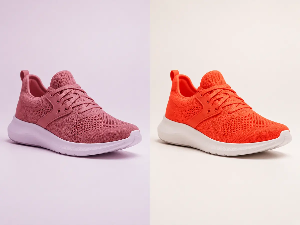
Agree the reference before correcting the image
Record the source of the colour decision: an approved photograph, a controlled capture or a physical sample viewed under agreed lighting. Include the product variant and reference version. A photograph of the sample taken on another phone introduces a new set of lighting and processing differences rather than resolving the original question.
When a physical match is critical, involve someone with appropriate colour-management expertise and a suitable viewing setup. The workflow should state who can approve that match. A reviewer looking at an uncalibrated laptop can judge some consistency problems, but cannot establish every aspect of physical colour fidelity.
Separate a colour cast from a material property
Inspect exposure and neutral balance before making selective changes. Then compare the product with its reference while preserving tonal variation that describes shape and texture. A shiny surface reflects its surroundings; making every part the same colour can flatten the object.
Review variants together. If the source photographs have different lighting, correcting each image in isolation may leave the collection inconsistent. Equally, do not force genuinely different fabrics or finishes to share identical numeric values. A single sampled pixel cannot describe an entire textured material.
Check the export and the page separately
Keep the embedded colour profile with the approved master. For a broadly compatible web output, an sRGB derivative is often appropriate; use the editor’s colour conversion process rather than merely assigning a different profile. Reopen the exported file in a colour-managed viewer and inspect it before upload.
Next inspect the actual product page on representative devices. Compare like with like: the same file, similar viewing conditions and known display settings. Night modes, automatic brightness and ambient light can change perception. Record an observed problem rather than compensating the master for one unexplained screen.
Describe the limit honestly
Hypothetical example: a blue jacket matches the approved reference on the review display but looks greener on a phone with a warm display mode enabled. Changing the master to offset that mode may make other displays less accurate. Confirm the display condition before requesting another colour correction.
Tell customers that screen appearance can vary without using that statement to excuse an incorrect variant or obvious editing error. Retain the reference, approved master and export settings so a complaint can be investigated. If the issue concerns missing product evidence rather than colour processing, request a better source instead of continuing to adjust an uncertain file.